Get a Customized Solution for Your IT Needs
+91 702-705-8777
info@pansofic.com
55-56, 1st floor, Chandigarh Complex, Prabhu Prem Puram, Ambala Cantt, Haryana 133006

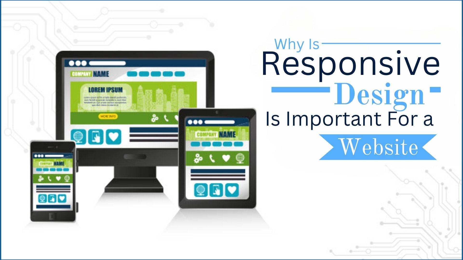
Responsive design ensures websites adapt to all devices, enhancing UX, SEO, and conversions. A must-have for modern web success. Stay mobile-friendly!

In today's digital landscape, having a website is essential for businesses, organizations, and personal brands. However, simply having a website is not enough. With the increasing use of mobile devices, ensuring that your website adapts seamlessly across different screen sizes is crucial. This is where responsive design comes into play. A responsive website, designed by a skilled Web Designer , provides an optimal viewing and interaction experience, improving user engagement and search engine rankings. In this blog, we will explore why responsive design is essential and how it can benefit businesses and users alike.
Responsive web design (RWD) is an approach that ensures a website adapts to different screen sizes and devices, including desktops, tablets, and smartphones. It uses flexible grids, fluid layouts, and media queries to dynamically adjust the website’s appearance and functionality.
Rather than creating multiple versions of a website for different devices, responsive design allows a single website to adjust automatically, enhancing usability and ensuring a seamless experience for all visitors.
1. Enhances User Experience (UX) :-User experience is a key factor in determining the success of a website. A site that looks good and functions well on all devices keeps visitors engaged. If users have to pinch, zoom, or scroll excessively to navigate your site, they are likely to leave. Responsive design ensures that content is easy to read and navigate, leading to a positive user experience.
2. Improves Search Engine Rankings (SEO) :- Search engines like Google prioritize mobile-friendly websites. In 2015, Google introduced mobile-first indexing, meaning it predominantly uses the mobile version of a site for ranking and indexing. Websites that are not optimized for mobile devices may experience lower rankings, reducing their visibility and organic traffic. By implementing responsive design , businesses can improve their SEO and increase their chances of appearing in search results.
3. Increases Mobile Traffic :- Mobile internet usage has surpassed desktop browsing, with more than 60% of global web traffic coming from mobile devices. If your website is not mobile-friendly, you risk losing a significant portion of your audience. A responsive design ensures that mobile users have a smooth and enjoyable experience, encouraging them to stay on your site longer.
4. Cost-Effective and Easy Maintenance :- Before responsive design became popular, businesses had to create separate desktop and mobile versions of their websites. This approach required more resources, time, and maintenance. With responsive design, you only need to manage a single website, reducing costs and simplifying updates and maintenance.
5. Boosts Conversion Rates and Sales :- A well-optimized website enhances user engagement, leading to increased conversions and sales. Whether you run an e-commerce store or a service-based business, ensuring that visitors can easily browse, find information, and make purchases from any device significantly impacts your revenue.
A poor mobile experience can drive potential customers away, while a responsive design ensures that all users, regardless of their device, have an enjoyable browsing experience.
6. Supports Social Media Marketing :- Social media platforms drive a substantial amount of traffic to websites. Since many users access social media via mobile devices, having a responsive website ensures that visitors from social platforms can seamlessly browse your content without any issues. This enhances engagement and increases the chances of converting social media traffic into loyal customers.
7. Adapts to Future Devices :- Technology is constantly evolving, with new devices and screen sizes emerging regularly. Responsive design ensures that your website remains adaptable to future innovations without requiring major redesigns. By implementing a flexible and fluid design approach, your website will be ready for any new screen size that comes to market.
Suggested Read:- Why Every Business Needs a Custom Website
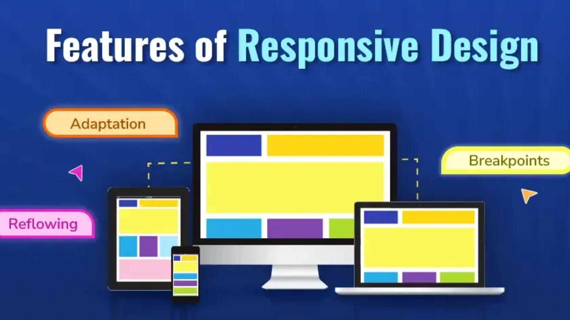
1. Adaptation:- A key aspect of responsive design is adaptation, which allows a website to adjust dynamically to different screen resolutions. Whether a user is browsing on a large desktop monitor or a small smartphone, the website’s layout, images, and content automatically resize to fit the screen perfectly. This eliminates the need for users to zoom in or scroll excessively, enhancing usability.
2. Breakpoints:- Breakpoints are specific points in a website’s layout where the design adjusts based on screen size. These predefined breakpoints help developers create a consistent experience across multiple devices. By setting breakpoints, designers can ensure that elements such as navigation menus, images, and text blocks rearrange themselves for optimal viewing.
3. Reflowing Content:- Reflowing is the ability of a website’s content to adjust and reorganize itself depending on the device being used. Unlike fixed layouts, which can lead to text and images being cut off or misaligned, a responsive design ensures that content remains readable and visually appealing. This feature is crucial for improving the user experience and maintaining engagement.
4. Flexible Grid Layouts:- A flexible grid layout is the backbone of responsive web design. Instead of using fixed pixel dimensions, this feature utilizes percentage-based scaling to make website elements fluid. This approach allows columns, images, and text blocks to resize proportionally, ensuring a consistent look across different devices without compromising the design.
Suggested Read:- Latest Trending Web Development Tools

If you’re looking to make your website responsive, here are some steps to consider:
1. Use a Mobile-First Approach :- Designing with mobile users in mind first ensures that your site functions well on smaller screens before scaling up for larger ones. This approach aligns with Google’s mobile-first indexing and improves overall user experience.
2. Choose a Responsive Framework :- Popular CSS frameworks like Bootstrap and Foundation provide pre-built responsive design components, making it easier to create a mobile-friendly website.
3. Optimize Loading Speed :- Fast loading times are crucial for user retention. Use compressed images, lazy loading, and optimized code to enhance performance.
4. Test Across Multiple Devices :- Use tools like Google’s Mobile-Friendly Test, Browser, Stack, or real device testing to ensure your website functions properly on different screen sizes.
5. Regularly Update and Maintain Your Site :- Technology evolves rapidly, so keep your website updated to maintain compatibility with new devices and web standards.
Suggested Read:- Web Development For Beginners
In the digital age, responsive design is no longer optional—it’s a necessity. A responsive website enhances user experience, boosts SEO, increases mobile traffic, and drives conversions. It also ensures that your website remains adaptable to future technological advancements, making it a long-term investment in your brand’s online presence.
Whether you're launching a new website or revamping an existing one, incorporating responsive design should be a top priority. By doing so, you create a seamless experience for all users, regardless of the device they use, ultimately leading to greater success in the digital space.


 Seo Admin
Jan 21, 2026
 Seo Admin
Nov 07, 2025
 Seo Admin
Apr 17, 2026
 Seo Admin
Dec 24, 2025
 Seo Admin
Jul 18, 2025